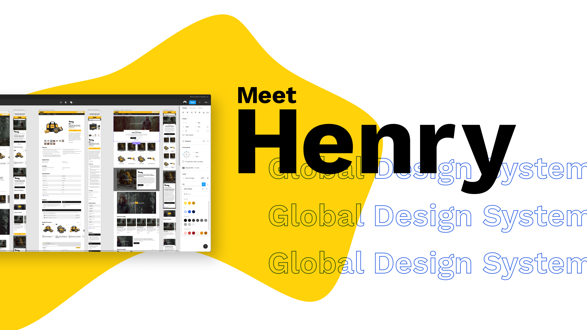
Henry Global Design System
Project Overview
Building and evolving a multi-brand design system called Henry, aligning disparate teams on a unified design language for Stanley Black & Decker's global catalog of online brand experiences.
My Role
Design System Advocate, UI Design, Design System Management and Documentation
Team Credits
Joseph C., Global UX Manager
Liz H., Senior UX Designer
Matt G., UX Engineer
Michael M., UX & Accessibility Designer
Erin Goldstrom, UX Designer (Me)
Thomas C., UX Strategist
Chris F., UX Researcher
Paulina D., UX Research Strategist
Tools
Figma
Confluence
Challenges & Goals
The Problem
Until 2019, Stanley Black & Decker lacked a systematic approach to designing user interfaces across its extensive brand portfolio. Teams worked in siloes and independently defined standards for creating websites, resulting in fragmented brand experiences across the globe.
In 2020, Stanley Black & Decker embarked on a three-year rollout plan to re-platform all of its brand marketing websites, spotlighting the following challenges:
Design inconsistencies across market websites and microsites
Conflicting direction and guidelines
Duplicate efforts of recreating common elements
Pressure to deliver solutions quickly without adequate discovery and research
Siloed teams working with disjointed communication
Business Landscape
53k employees
60 countries
Over 14 unique brands
Over 500k products across brands
Goal
As the Global UX team, our goal was to work collaboratively with teams across the organization to build and scale a design language that is flexible, accessible, and global.
Process
Interface Inventory
To begin systemizing the interface, a teammate and I conducted an audit of current brand marketing websites across regions. The purpose of this was to collect a visual inventory that documents inconsistencies and defines the essential design patterns and elements. This information was the basis for determining components and patterns.
Market Research
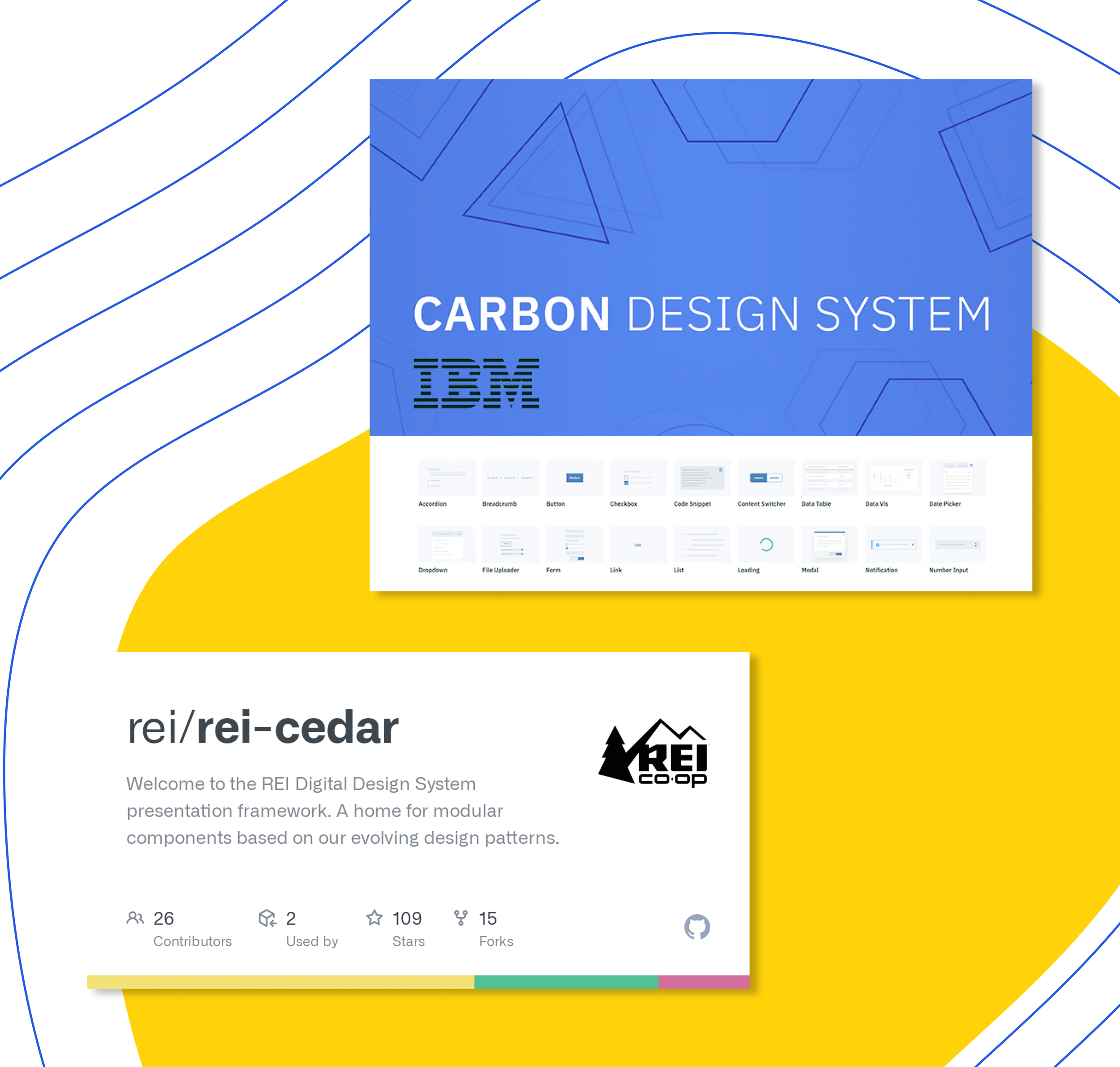
After analyzing our interface inventory, we looked externally at other design systems. We explored established design systems, such as IBM's Carbon and REI's Cedar, to learn from their approach and structure. With the oversight of our team's UX Engineer, we thoughtfully defined the three main parts of our design system: Foundations, Components, and Page Templates.
Accessibility
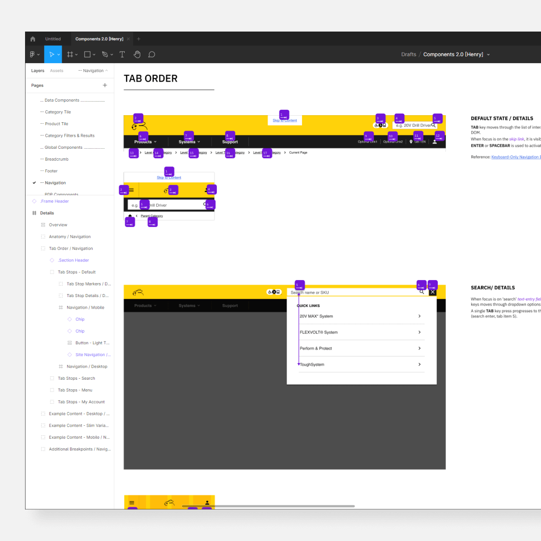
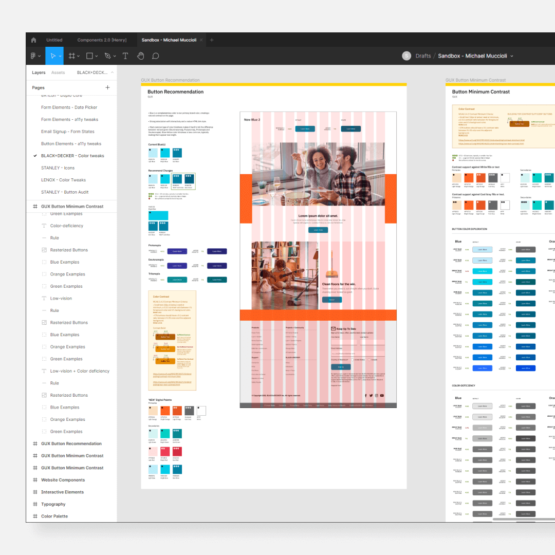
As one of our core design principles, accessibility was always top of mind. Our team built Henry to meet and exceed the accessibility standards outlined in the Web Content Accessibility Guidelines (WCAG). With guidance from outside partners and our team's Lead Accessibility Designer, the design system was pressure tested for Level AA and AAA compliance. Areas we focused on specifically included color contrast ratios, tab order for keyboard navigation, input feedback, and content accessibility. Additionally, our design system documentation included accessibility guidelines, best practices, and recommended tools.
Structure
Foundations
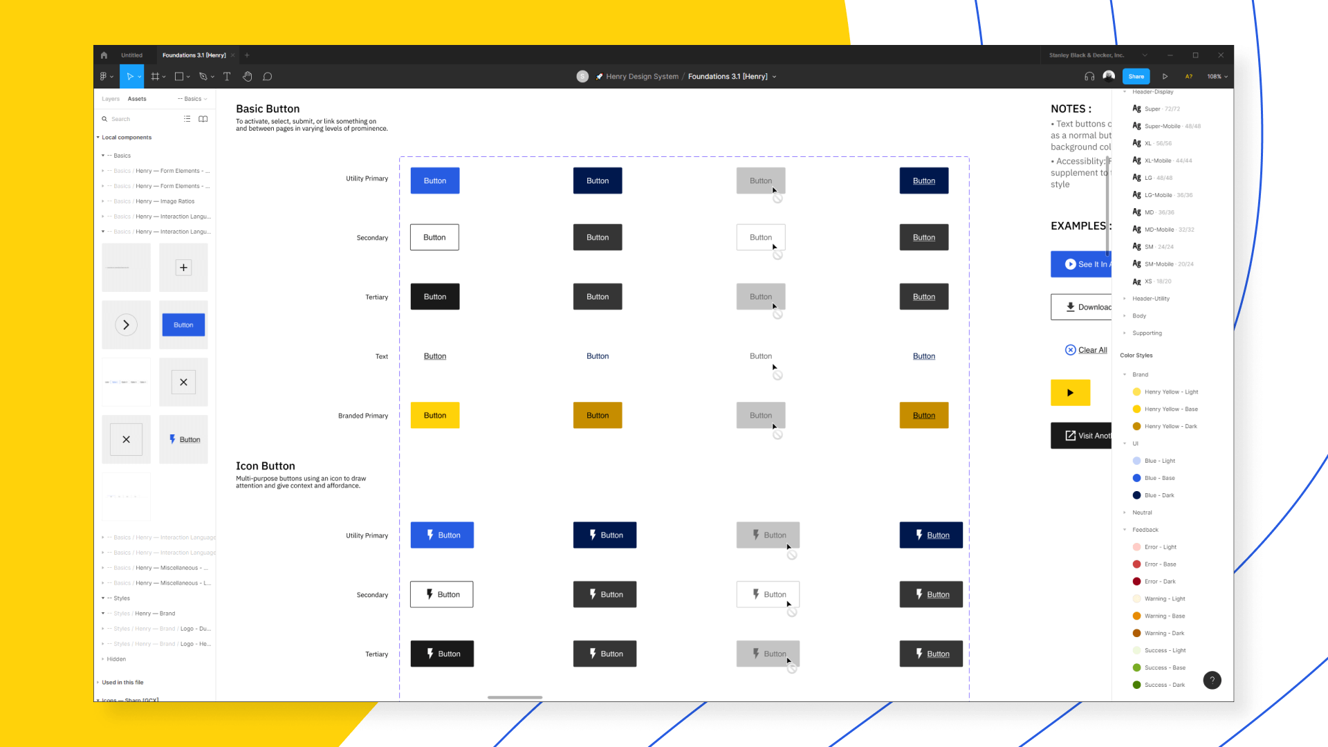
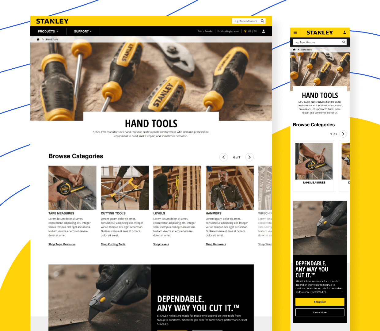
Foundations were the system basics, which lived at the core of each brand and continuously evolved alongside the brands. They consisted of brand-specific visual elements (including typography, color palette, icon styles, spacing, image ratios, and more) along with interactive UI elements (buttons, form fields, etc.). Aligning on and adhering to Foundations enabled teams to achieve visual coherence and seamlessness across the board.
Components
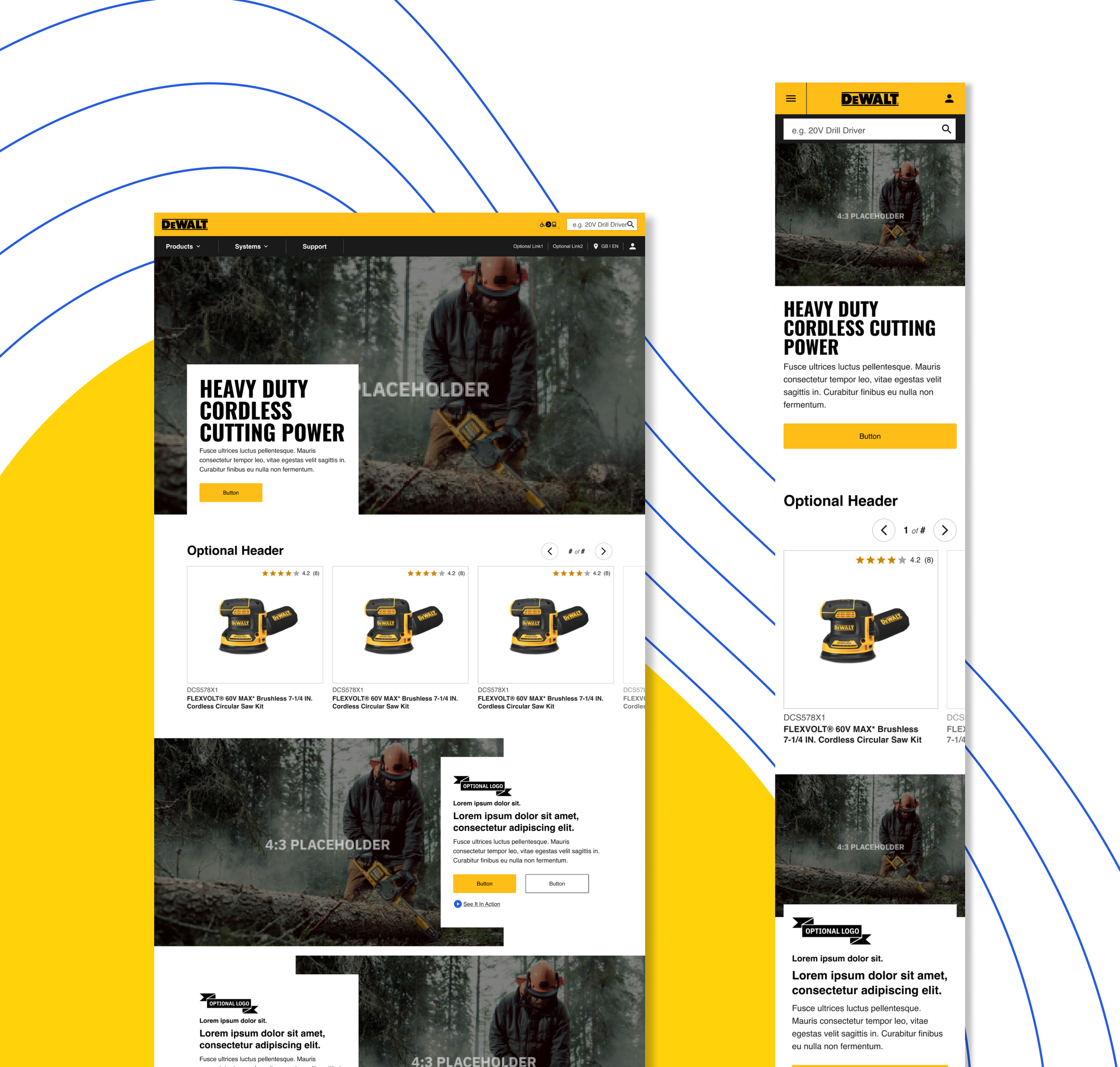
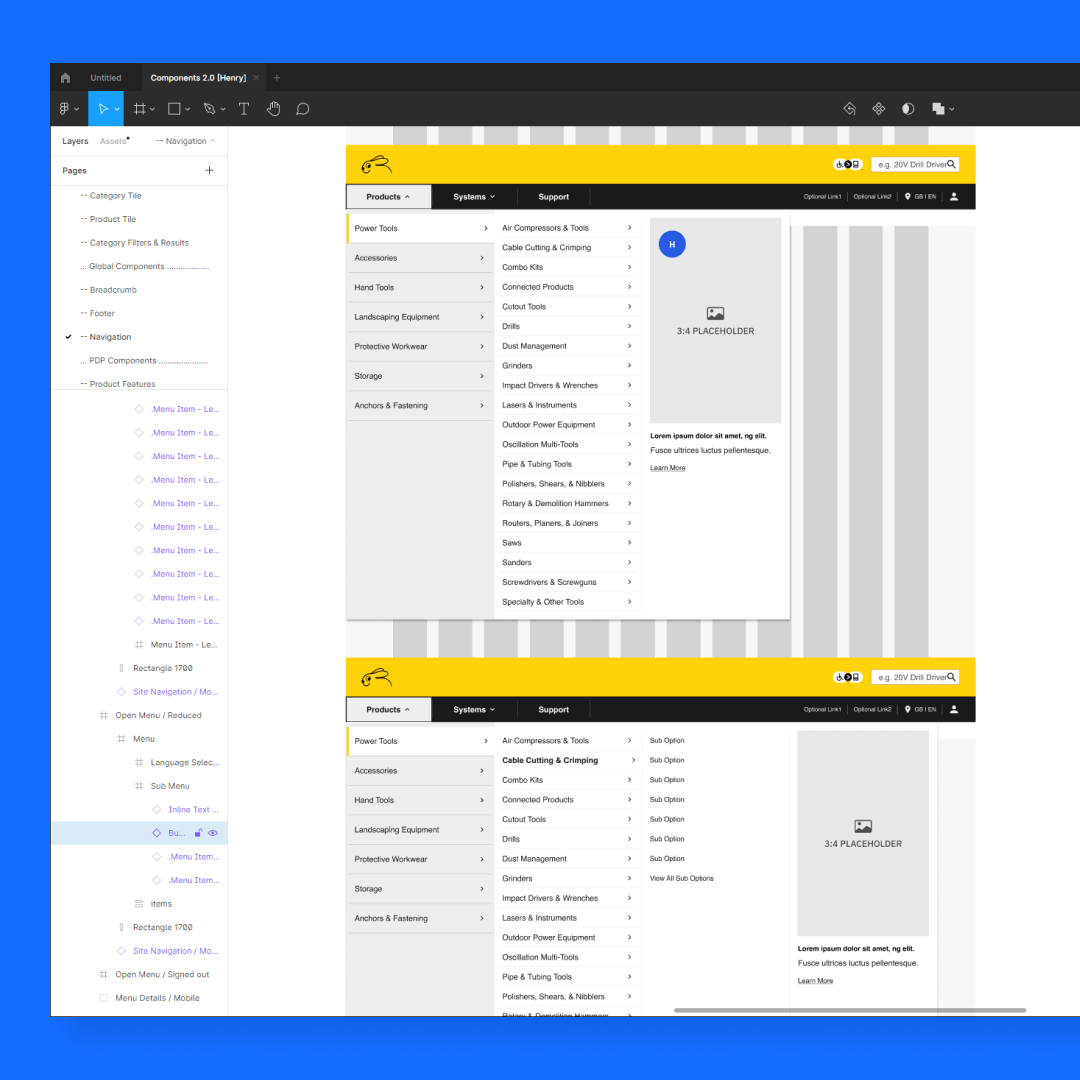
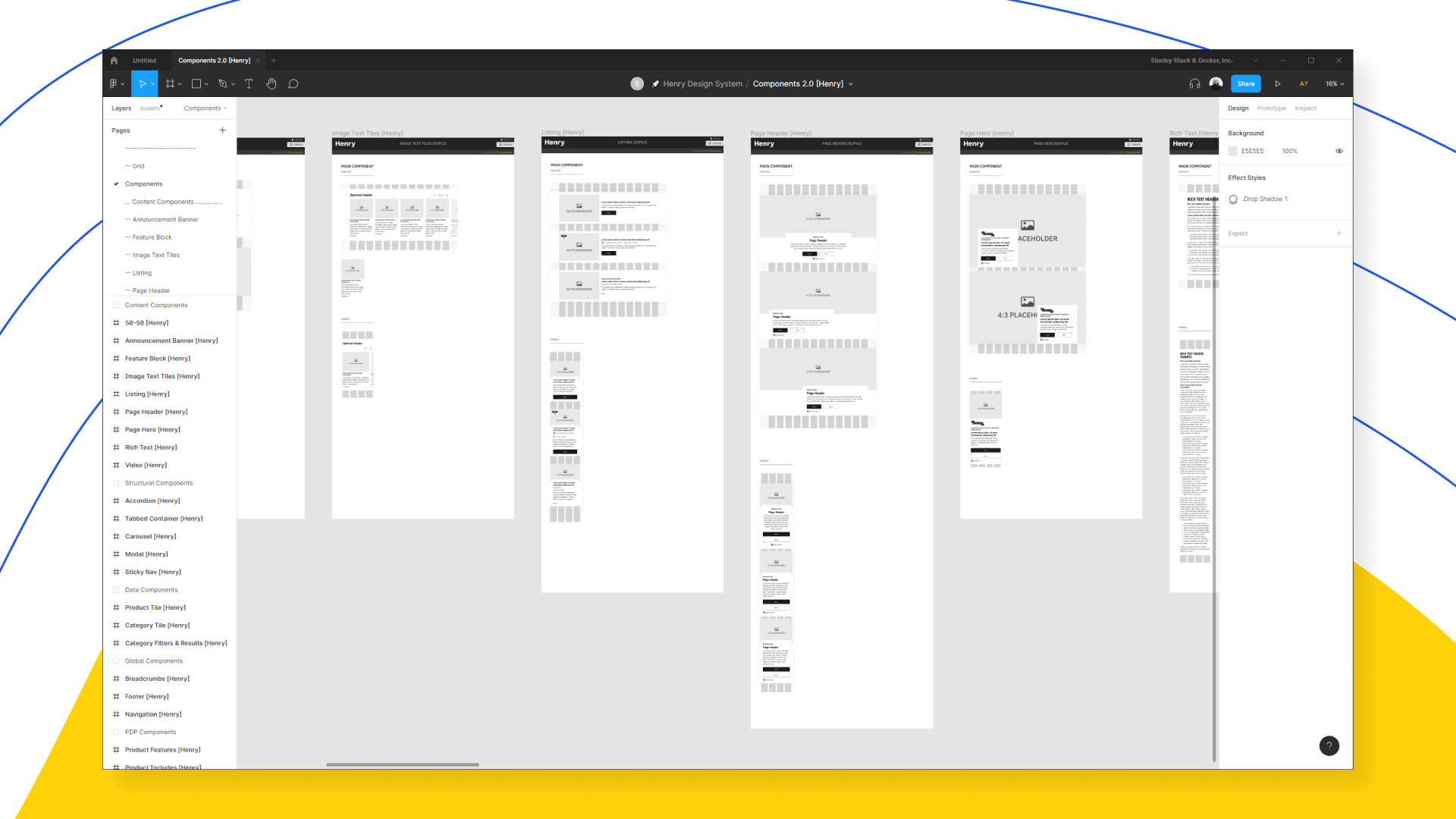
Each brand had a component catalog- a collection of reusable interface elements (such as Page Heroes and Carousels) styled per their corresponding Foundations file. We categorized components as global, structural, content, data, or utility so that design decisions were efficient and accurate based on the page's context.
Each component had thorough documentation, specifying interactive states, minimum and maximum content, additional breakpoints, tab stops, keyboard control requirements, and more.
Page Templates
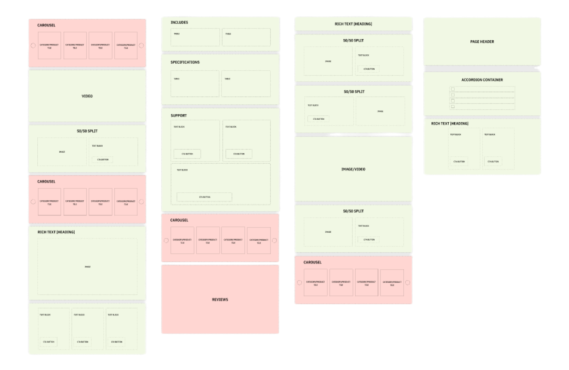
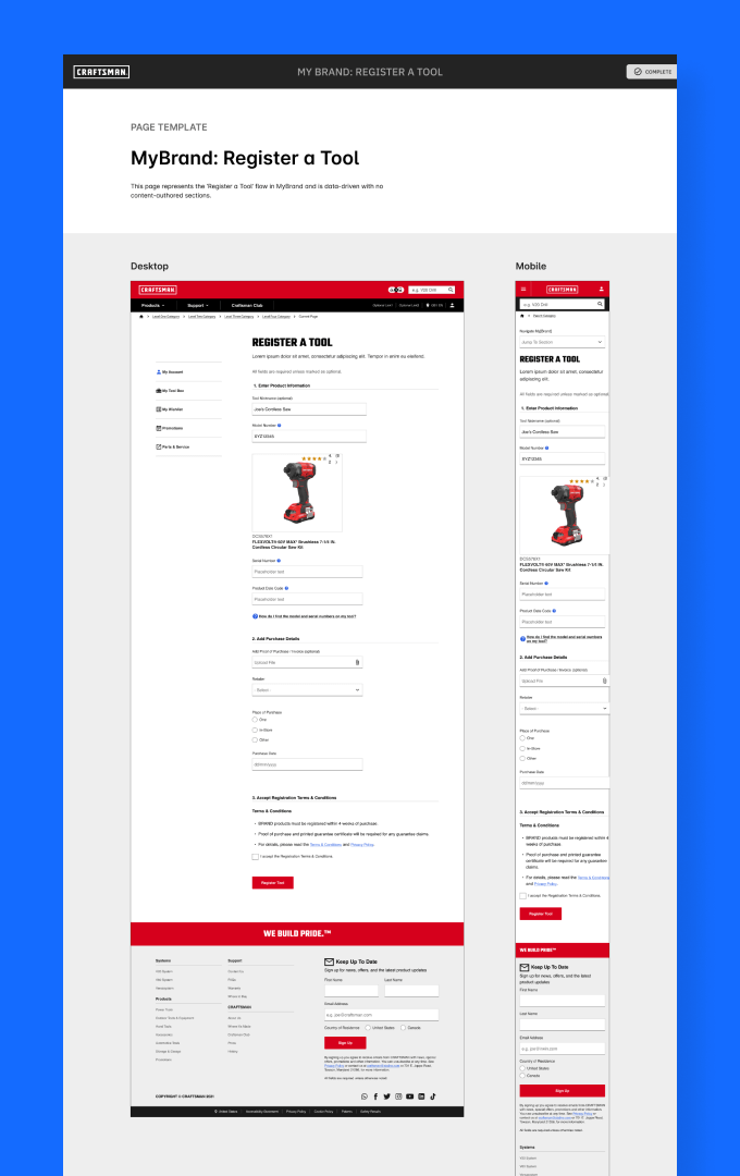
Page Templates represented structurally similar page layouts across brands that address common user objectives (such as a home page, product detail page, etc.). Each brand had a Page Templates file built with its corresponding foundations and components.
Documentation
After defining and designing the Foundations, Components, and Page Templates, our next challenge was to ensure our system included proper documentation and governance around brand implementation.
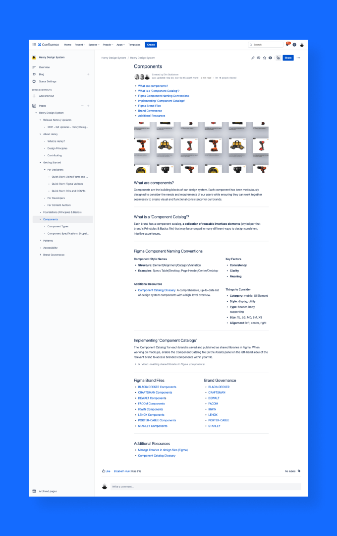
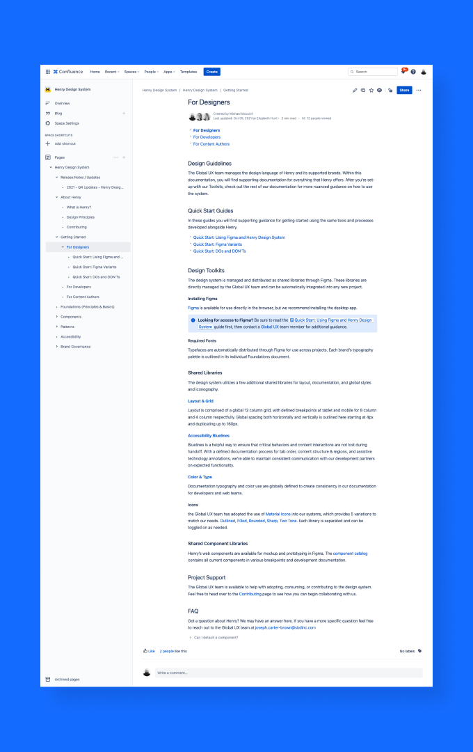
Our team created and maintained documentation resources in a Confluence space, working closely with our design, content author, and development partners to ensure we met their specific needs. The documentation included:
Our design principles.
Quickstart guides.
Accessibility standards.
Best practices for designing and testing.
Brand governance documents unique to each brand.
Evangelization, Feedback, and Iteration
One of my primary responsibilities was socializing the design system with different stakeholders and teams. It was important to articulate the design system benefits in various contexts and provide team-specific resources to improve their workflows and processes.
For example, when presenting to leadership, I focused on demonstrating and quantifying the cost of inefficiencies and how implementing a design system would enable us to meet business goals faster and lower costs.
Additionally, my teammate (Matt, UX Engineer) and I held feedback sessions with CMS Specialists-who had first-hand experience using the components to build websites-to assess which elements were working and which needed improvement. We worked closely with our development partners to implement changes to evolve and improve upon the system. My goal was to anticipate the needs of various teams and provide resources that show how the design system can alleviate their specific pain points.
Key Takeaways
Stay Flexible - The design system is ever-evolving and needs to be constantly improved, iterated, and built upon. Always welcome and encourage new ideas.
Design systems are a living, breathing thing - They require a dedicated team actively involved in their growth and maintenance. Getting buy-in from cross-functional teams and driving system adoption are worthwhile challenges.
To understand global needs, you need to collaborate globally - As the Global UX Team, we were highly conscious that our entire team was based in the US. With the help of our global partners, we were able to identify some of our significant blind spots and work to improve them. Considering cross-cultural needs continued to be an immense opportunity in our work.
