Background
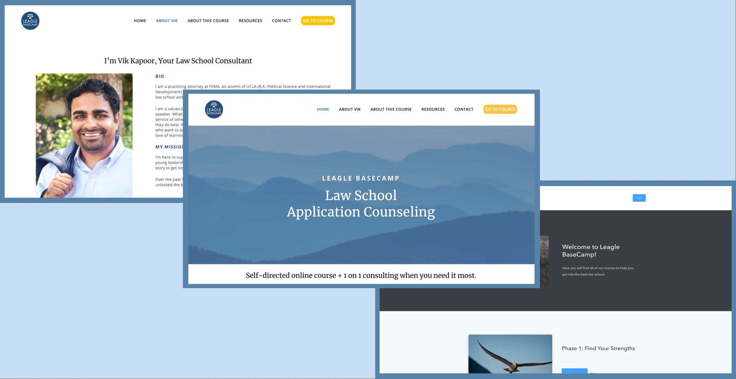
Leagle BaseCamp is a one-on-one consulting service and online course for the law school admissions process. The service provides personalized strategies and on demand support for law school applicants.
Task
Test, optimize and improve the current flow in order to reduce early drop-off and encourage completion of the program.
Role & Scope
My role on a 4 person team was as lead of visual design and user research synthesis.
This project was a 3 week sprint.
Deliverables
6 User Interviews
1 Persona
Squarespace Website
Podia Website (Learning Management System)
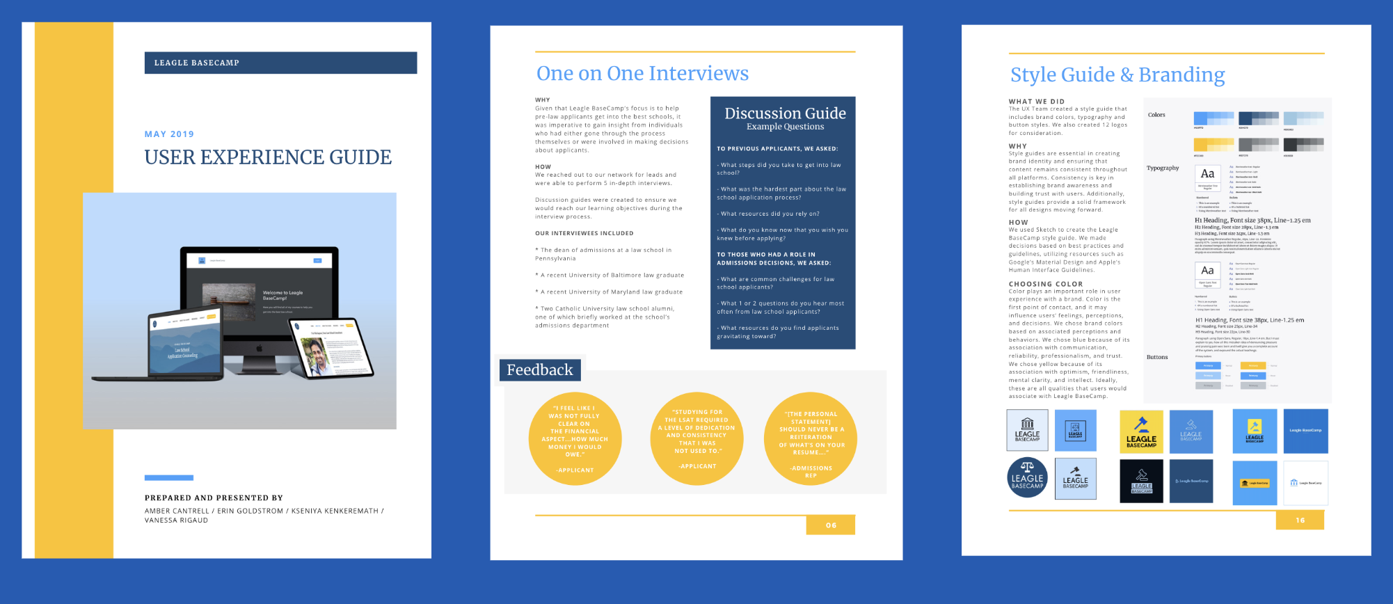
Deliverables Document (User Experience Guide)
Methods
Survey
User Interviews
Affinity Mapping
Card Sorting
Competitive Analysis
Persona Development
Customer Journey Mapping
Wireframing
Usability Testing
Problem
Law school applicants need a way to understand and use Leagle BaseCamp’s online course & one-on-one consulting to decrease the difficulty of the law school application process.
Solution
By designing a user centered and trustworthy website and course page, we will allow applicants to engage with Leagle BaseCamp to simplify and facilitate the law school application process.


The Process
Survey
To start, my team created a survey with a goal of understanding:
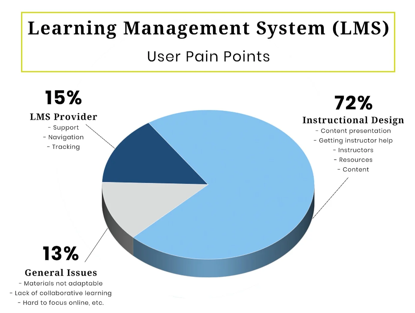
What components of online learning are expected (such as progress monitoring)
How to match user expectations with course structure and layout to increase engagement
Survey Responses: 24 people
One-on-One Interviews: 6 people
Insights Gained
The main takeaways from the survey were:
Course content should be organized into short, digestible segments
Course content is perceived as valuable when it is thorough and comprehensive
Learning platform must provide intuitive navigation and progress tracking
User Interviews
Given that Leagle BaseCamp’s focus is to help pre-law applicants get into the best schools, it was imperative to gain insight from individuals who had either gone through the process themselves or were involved in making decisions about applicants.
“Studying for the LSAT required a level of dedication and consistency that I was not used to.”
Affinity Mapping
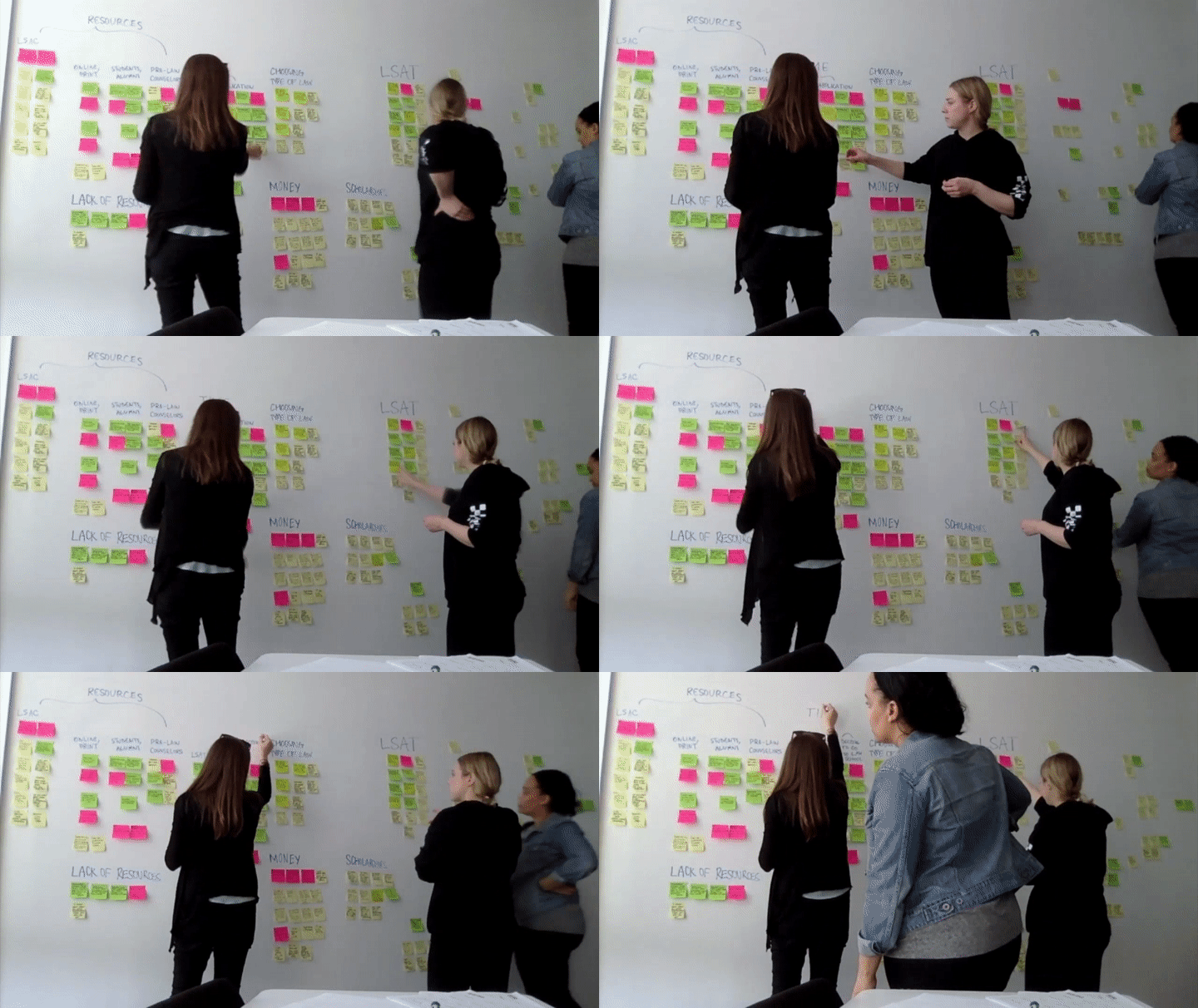
We completed two rounds of affinity mapping: one for survey results and one for interview results.
Key Takeaway
People take online courses because they value working at their own pace through high quality, detailed content.
Customer Journey Mapping
The customer journey map visualized Ashley’s experience when she discovers the Leagle BaseCamp website. Initially, Ashley is excited about finding the service. However, she then experiences some emotional ups and downs, including:
Confusion about what services Leagle BaseCamp actually provides
Unsure how to sign up
Overwhelmed with the amount of content being presented at once
Unfortunately, Ashley’s negative experiences outweighed the positive, and she does not return to the site. Ashley’s experience, along with our research data, helped us formulate our problem and solution statements.
User Persona
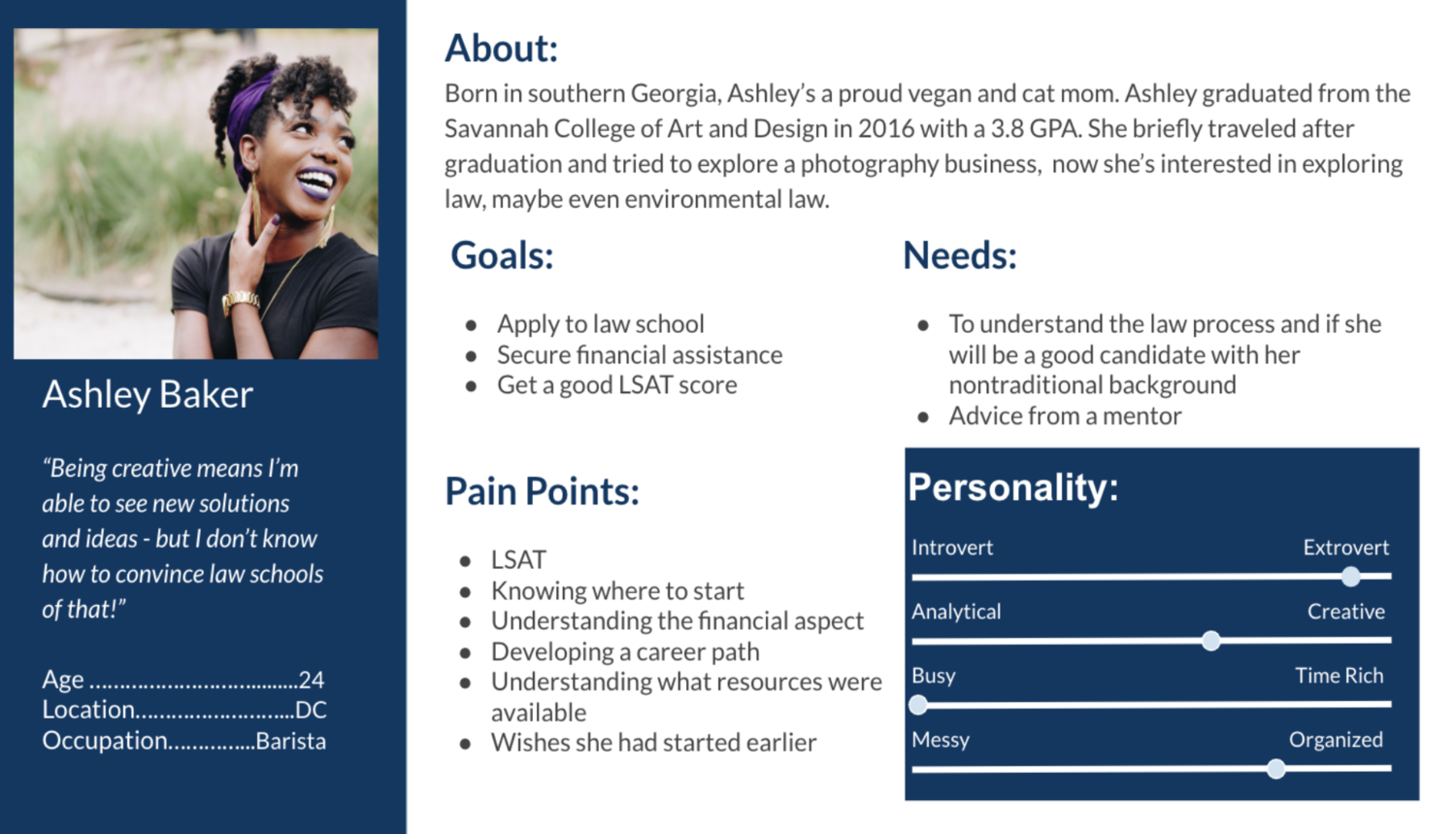
Based on our research, we were able to develop a user persona, or a representative user we can design for. She is a fictional character who embodies behavior and goal patterns we identified in users during our research.
Her name is Ashley Baker, and she is a 24 year old cat mom and proud vegan. After graduating from design school, she dabbled in travel and photography. Currently, she is a barista who is interested in environmental law, but she doesn’t know where to start. She wonders if she would be a good candidate for law school, considering her non-traditional background. Ashley is looking for advice from a mentor regarding the entire law school application process, along with her perceived barriers to applying.

Sketches & Wireframes
During the initial stages of design, we utilized quick sketching as a way to explore, refine, and communicate our ideas. This was a useful way to consider different possibilities before deciding which concepts to pursue.
Style Guide & Branding
Next, using Sketch, we created a style guide that includes brand colors, typography and button styles. We also created 12 logos for consideration. We made decisions based on best practices and guidelines, utilizing resources such as Google’s Material Design and Apple’s Human Interface Guidelines.
Marvel Prototype: Insights Gained
“Start here” same as Contact? —> Remove requirement to talk to Vik before starting the course
Users want more details regarding Vik’s background —> Change “Who I Am” to “About Vik” - feature qualifications, etc.
Users had trouble locating course details —> Change “About” to “About This Course” to eliminate confusion
User Testing
We conducted 5 rounds of user testing each for our clickable digital prototype (made using Marvel based on hand drawn sketches), Squarespace site, and Podia (Learning Management System) site. Users were asked to complete tasks and answer questions about the sites to determine what was or wasn’t working.
Podia: Insights Gained
Users validated the breakdown of content into phases
Users found left-hand-side navigation was intuitive and easy to follow
Users want a community aspect —> Recommended that the client consider discussion boards, peer review, etc.
Squarespace: Insights Gained
Users want clarification of services and benefits —> Feature clear, concise explanation of services
Users want details about meeting with Vik (timing, schedule, format) —> Set clear expectations for communication timeline
Users want to see cost upfront —> Recommended that client feature pricing
Finished Designs
Squarespace Website
Podia Website
User Experience Guide
After presenting our project to the client and handing off Squarespace and Podia sites with migrated content, we provided a User Experience Guide which provides a complete breakdown of our research, synthesis, design and iteration.
