Background
The Loro device is described as “a smart companion robot for the wheelchair user.” It aims to improve quality of life for people with physical challenges through “the ability to communicate, see, control, and connect with their environment.”
Task
Redesign Loro’s existing website (including recommendations for structure and information architecture), create an online store for website, and design an on-boarding experience and settings page for the Loro app.
Role & Scope
My role on a 2 person team was as lead of visual design, UX strategy, and usability testing. My main focus was Loro’s app.
This project was a 2 week sprint.
Deliverables
5 User Interviews
3 Personas
Clickable website prototype using Sketch
Clickable app prototype using Sketch & Principle
Methods
Survey
User Interviews
Affinity Mapping
Card Sorting
Competitive Analysis
Business Model Canvas
Persona Development
Customer Journey Mapping
Wireframing
Usability Testing
Problem
How might we help people with physical challenges easily access and understand Loro product information to improve their quality of life?
Solution
The design of a clear, intuitive website along with an easy to follow, informative app onboarding process to provide users with a positive product experience.

The Process
Survey & User Interviews
To start, my team created a survey with a goal of understanding:
What people look for when visiting a website for a product of interest
What people like & dislike about online purchasing processes
Survey Responses: 22 people
One-on-One Interviews: 5 people
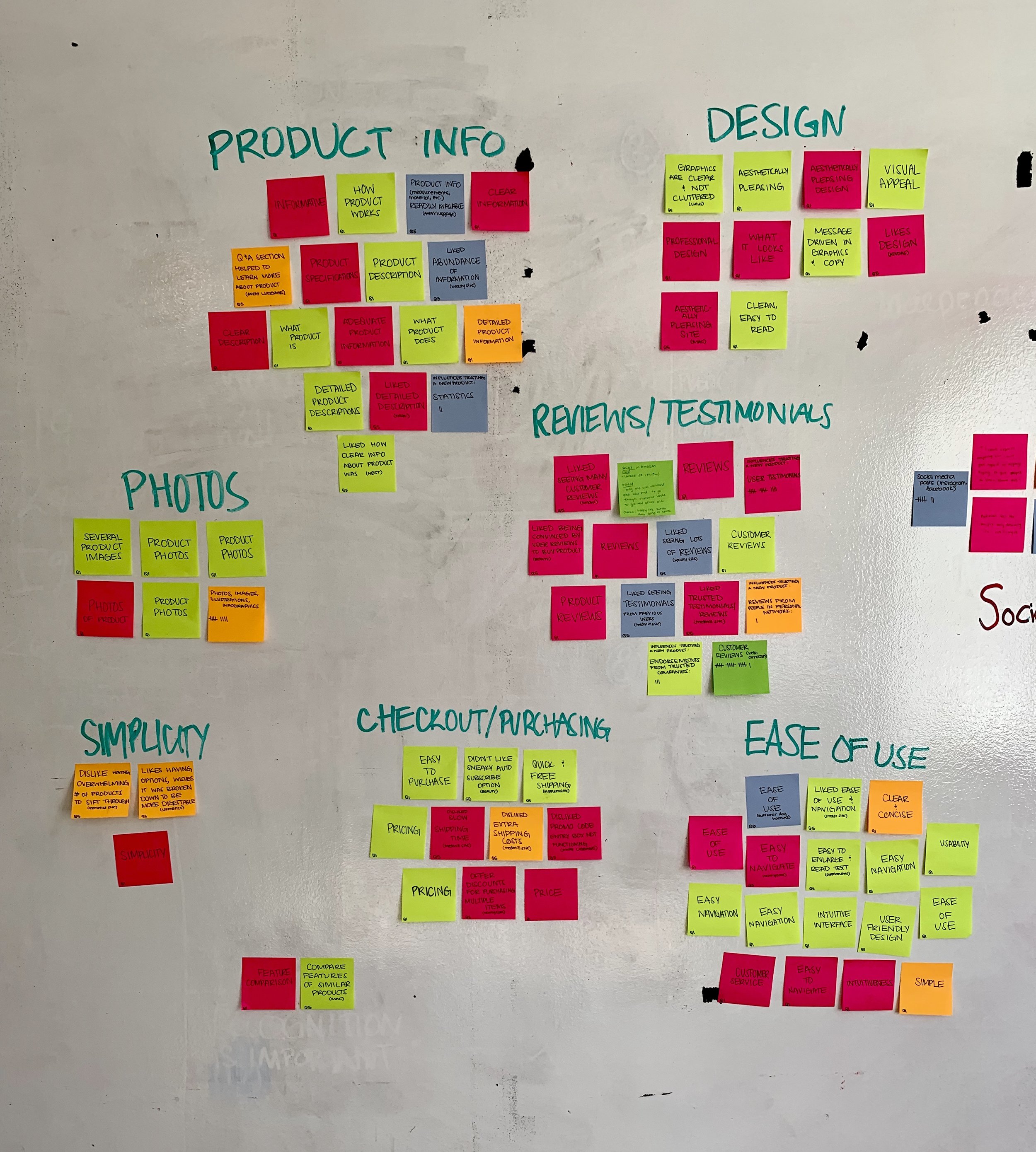
Insights Gained
The four main things that people value in a product website & online purchasing process are:
Reviews & testimonials
Product information (descriptions & features)
Product photos
Simplicity/ease of use
Visualization of some of our survey results corresponding to the following questions: “Through which of these online formats do you prefer to learn about a new product?” (left) and “What would influence your decision the most in trusting a new product?” (right)
Secondary Research
We ran into issues gaining access to users in wheelchairs, especially given the short time frame of the project. We had to get more creative with that portion of the research so we watched videos on Youtube to gain more insight into the daily lives of our target users. These videos ranged anywhere from 3 minutes — 15 minutes.
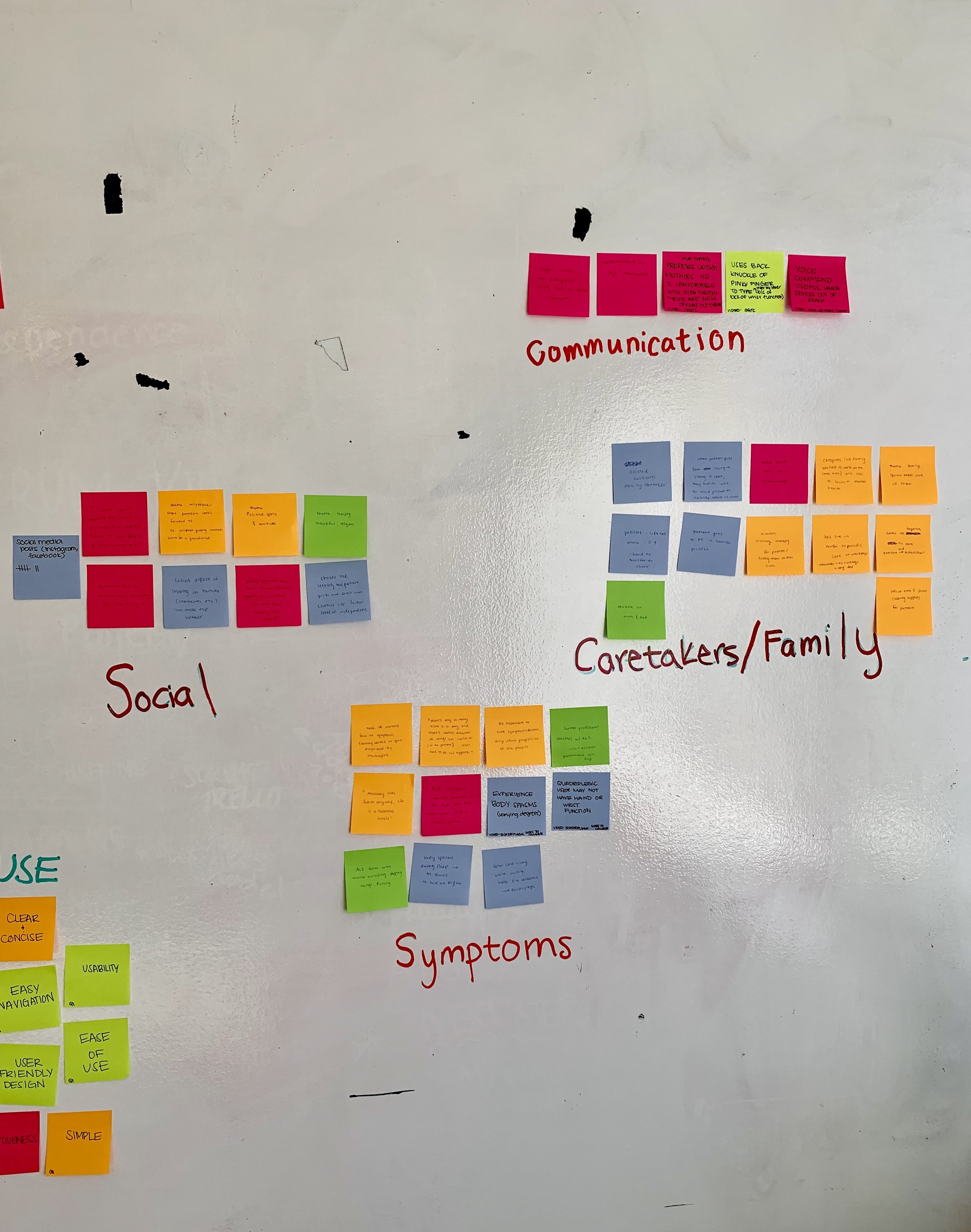
Insights Gained
Main findings during this portion of the research fell into four broad themes:
Social
Communication
Caregiver
Symptoms
Affinity Mapping
We completed 2 affinity maps, one for our surveys and interviews, and another for our secondary research. This helped us decide what content to prioritize.
Secondary Research Synthesis
A brief explanation of each of the four themes for our secondary research is listed below:
Social — a huge issue for many wheelchair users is that they face social isolation and don’t have enough contact with friends or family
Communication — many users were not able to effectively communicate with the outside world, this also hinders their independence and worsens their social isolation
Caregivers/Family — another theme in many of the videos is the stress that their caregiver endures. Many mentioned that making processes easier for the caregiver directly translates to making the user’s life easier (ex: dealing with insurance, mental health of caregiver)
Symptoms — this is a huge theme for obvious reasons, any ways we could use our product to alleviate symptoms for our users was important to us (ex: tremors, quick onset of disease for ALS, muscle degeneration)
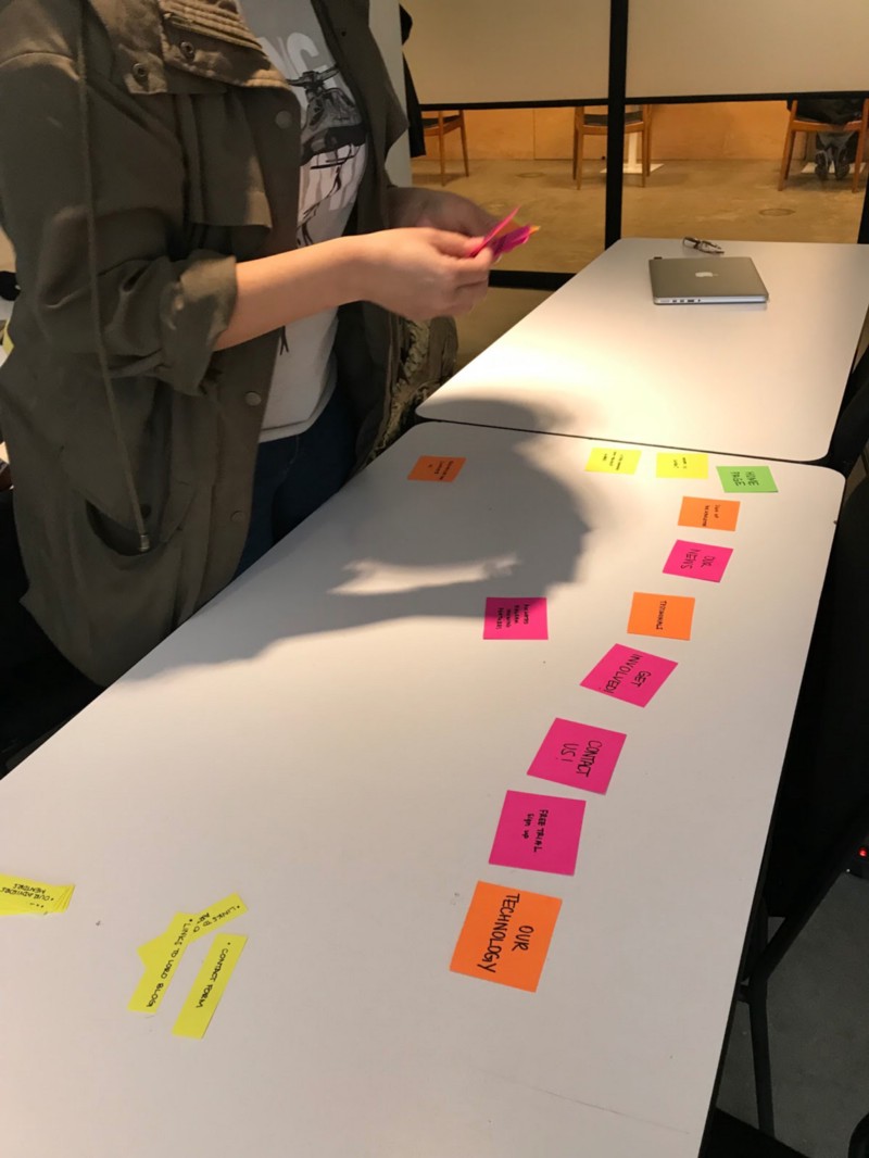
Card Sorting
Next, we moved on to card sorting to better understand how to present our content to the user. Six card sorts were conducted. The content on the cards was taken from Loro’s current website. This helped us decide on the information architecture of the website

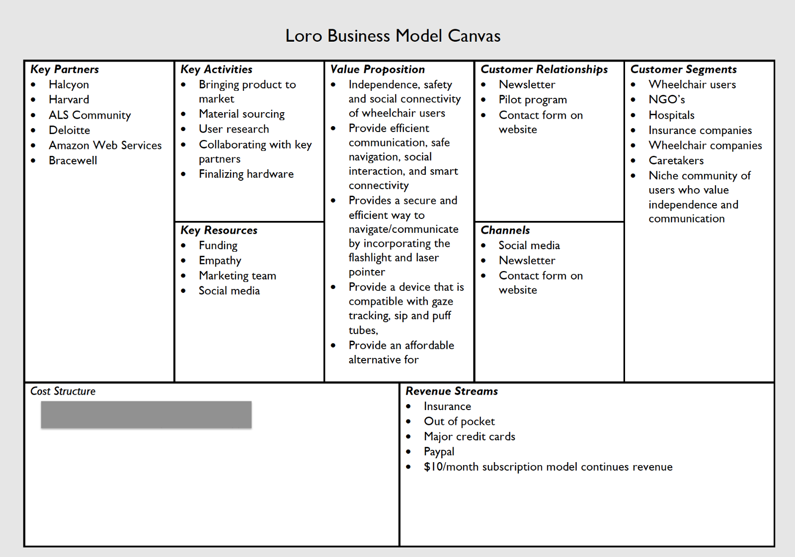
Business Canvas Model
We created a business model canvas to help us better understand Loro’s goals, partnerships, and activities. Through this, we were also able to gain insight into who would be purchasing our product, therefore understanding which customers to base our personas.
Competitive Analysis
We also completed a competitive analysis of direct and indirect competitors’ websites to gauge what content we should prioritize on the website.

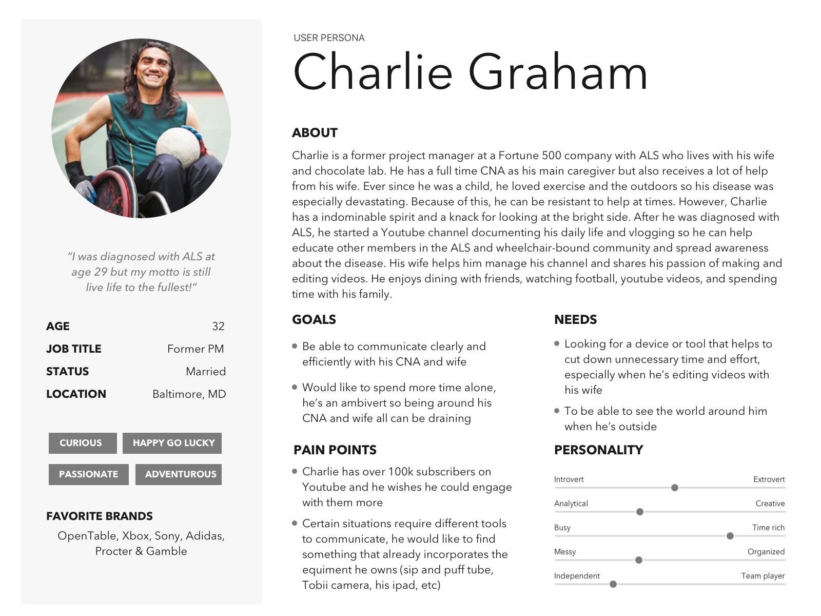
Persona Development
We created three user personas to empathize with each group of potential user and fully capture and communicate their specific goals and characteristics. All personas are based on our research. We defined the key audience segments as caregivers, B2B customers, and primary device users.


Customer Journey Mapping
Next, we created a journey map based on our research findings to visualize Edna’s (“The Caregiver” and our primary user) relationship with Loro. We wanted to evaluate every touchpoint between Edna and Loro, including the associated feelings, actions, opportunities and moments of clarity.
Customer Journey Map
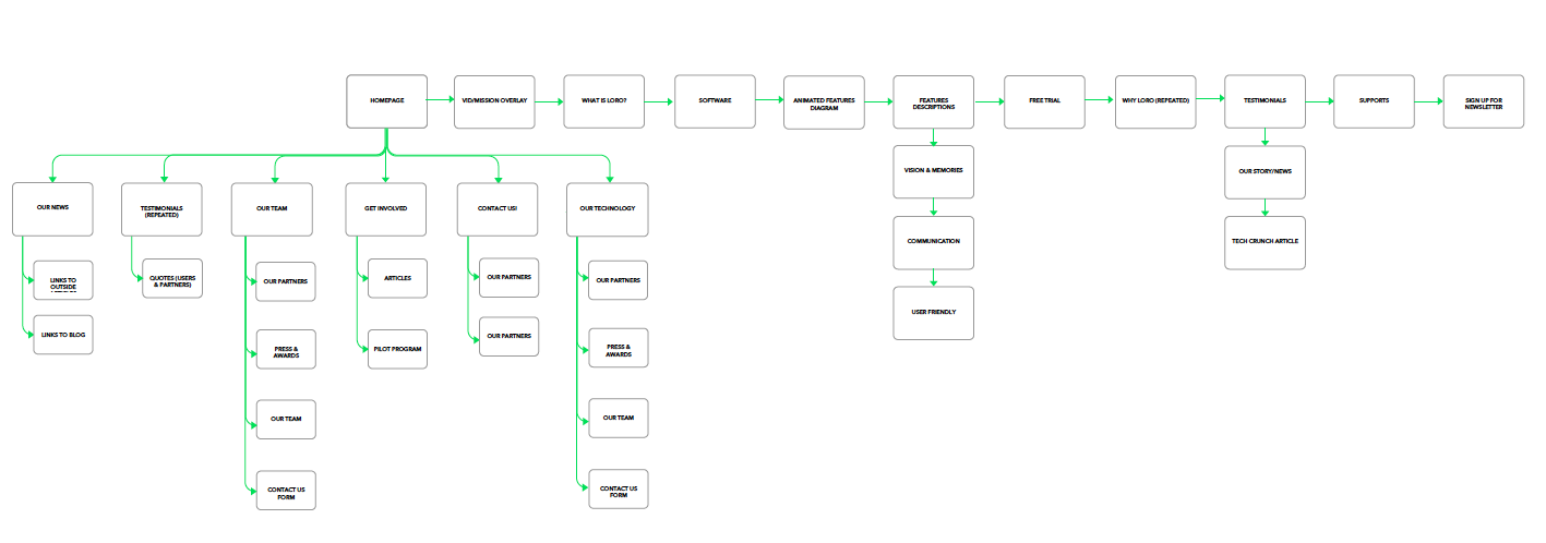
Information Architecture
In order to visualize the current website and for us to better understand how to organize its content, we created sitemaps for the current site and our prototype. We used our card sort findings and best practices to inform our site’s organization. Our prototype uses an intuitive global navigation bar to organize the most relevant content into digestible chunks.
Wireframes
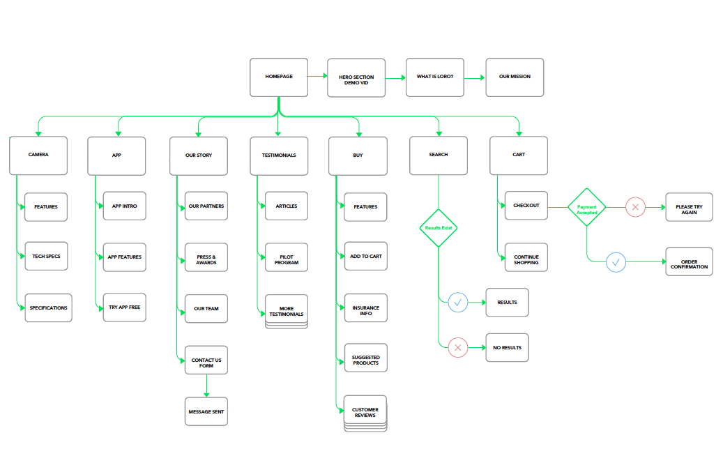
User Flows
In order to show the client how a user would experience our product, we created user flows for common tasks that would be completed on the site and app. Creating user flows also helped us focus on the experience and needs of the customer.
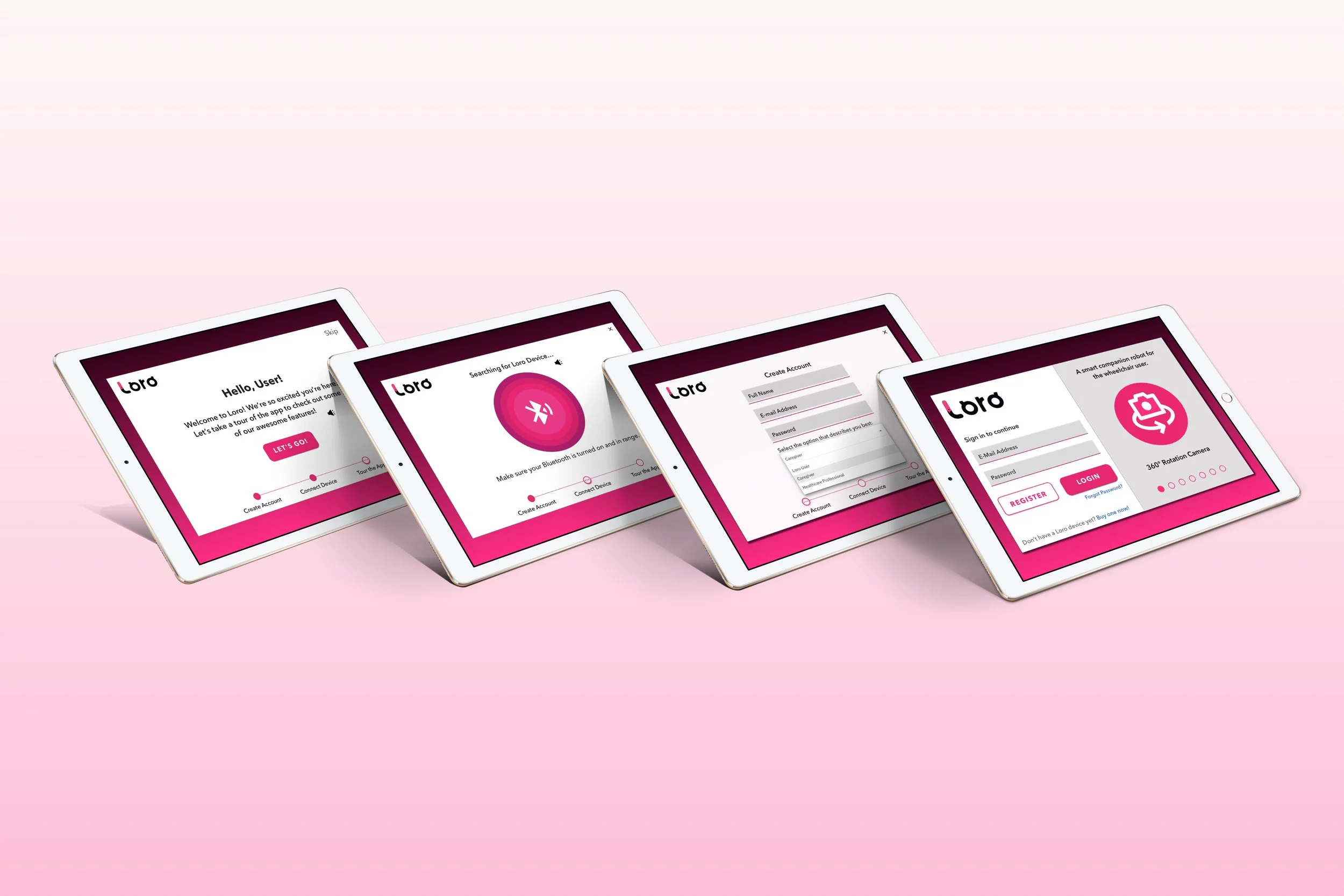
Onboarding & updating the closed captioning in Settings (App)
Current Website: Insights Gained
The gifs on the page are distracting
The listing of awards and partners lends legitimacy to the product
The navigation is not intuitive and sometimes repetitive
There are no customer reviews
The homepage is very long
A cleaner page is necessary
It’s creative and inviting
Users liked the testimonials
Usability Testing
We conducted usability testing with the current Loro website, and each of our prototypes. For the tests, we asked the test subjects to complete simple tasks like try to put the product in the cart (website), see if they could find all the features for the product (website), complete the onboarding process (app), and try to update the settings for closed captioning (app).
App Prototype: Insights Gained
The onboarding process was very clear and easy to complete
Use of big letters and contrast made it accessible
Lack of visual hierarchy — added color differentiation
Lack of text to speech icon — added
Missing global navigation — added
Website Prototype: Insights Gained
Clean aesthetics
The feature icons were repetitive — we categorized them by app and tablet features
The add to bag button is inconsistent with the cart icon — updated button to say “Add to Cart”
No “suggested products” section on product page — added
The content was organized in a digestible way
The checkout process was easy/seamless